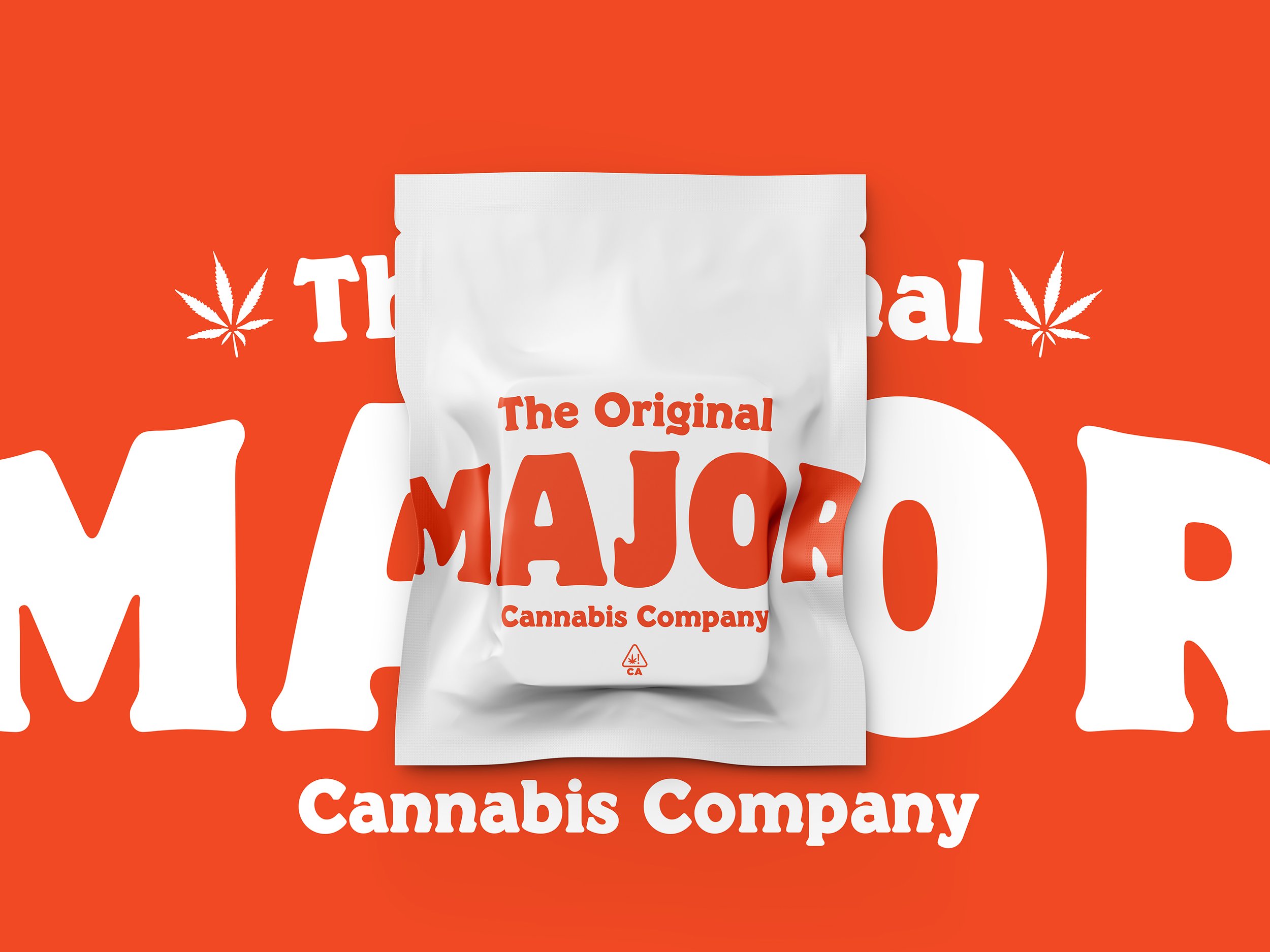

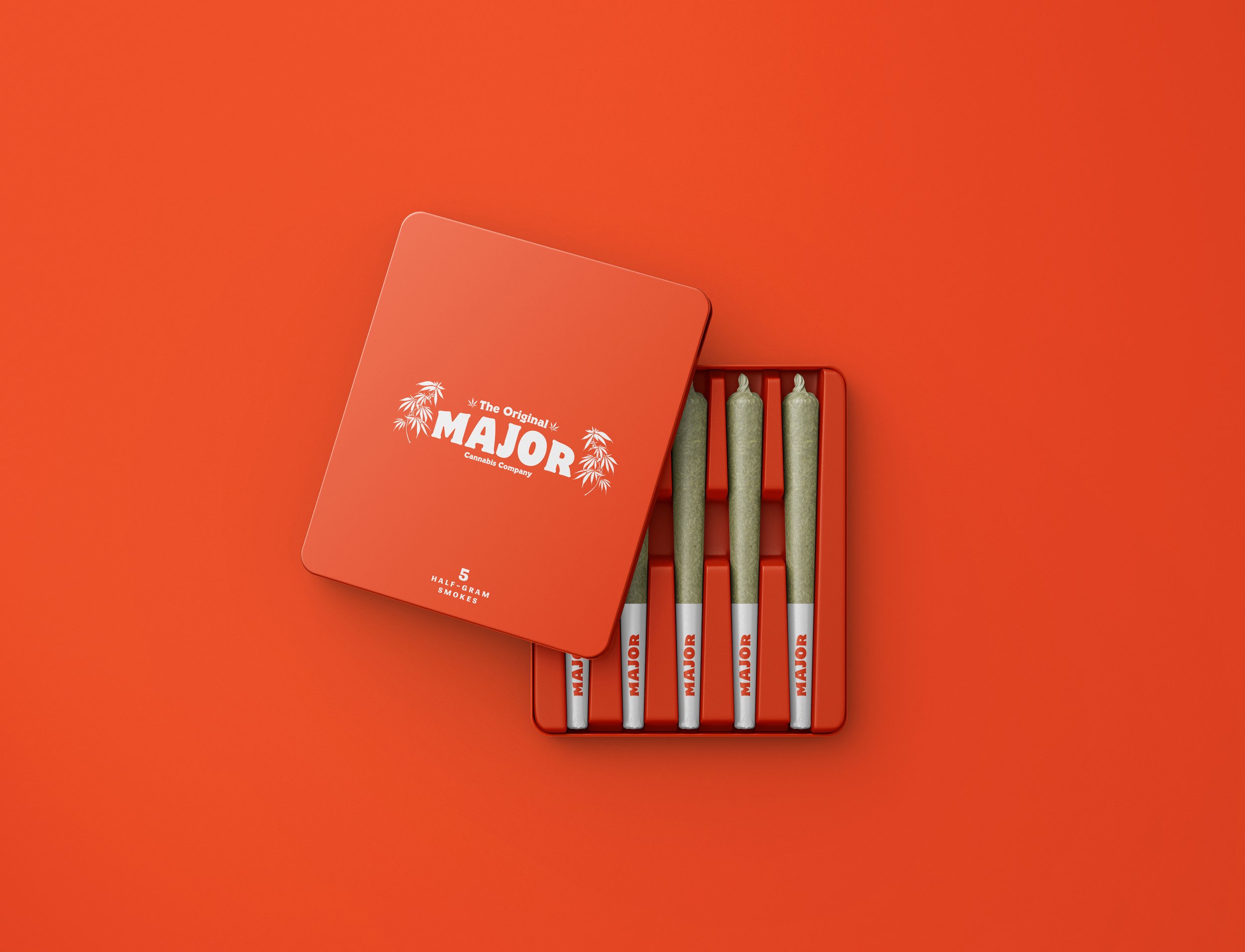
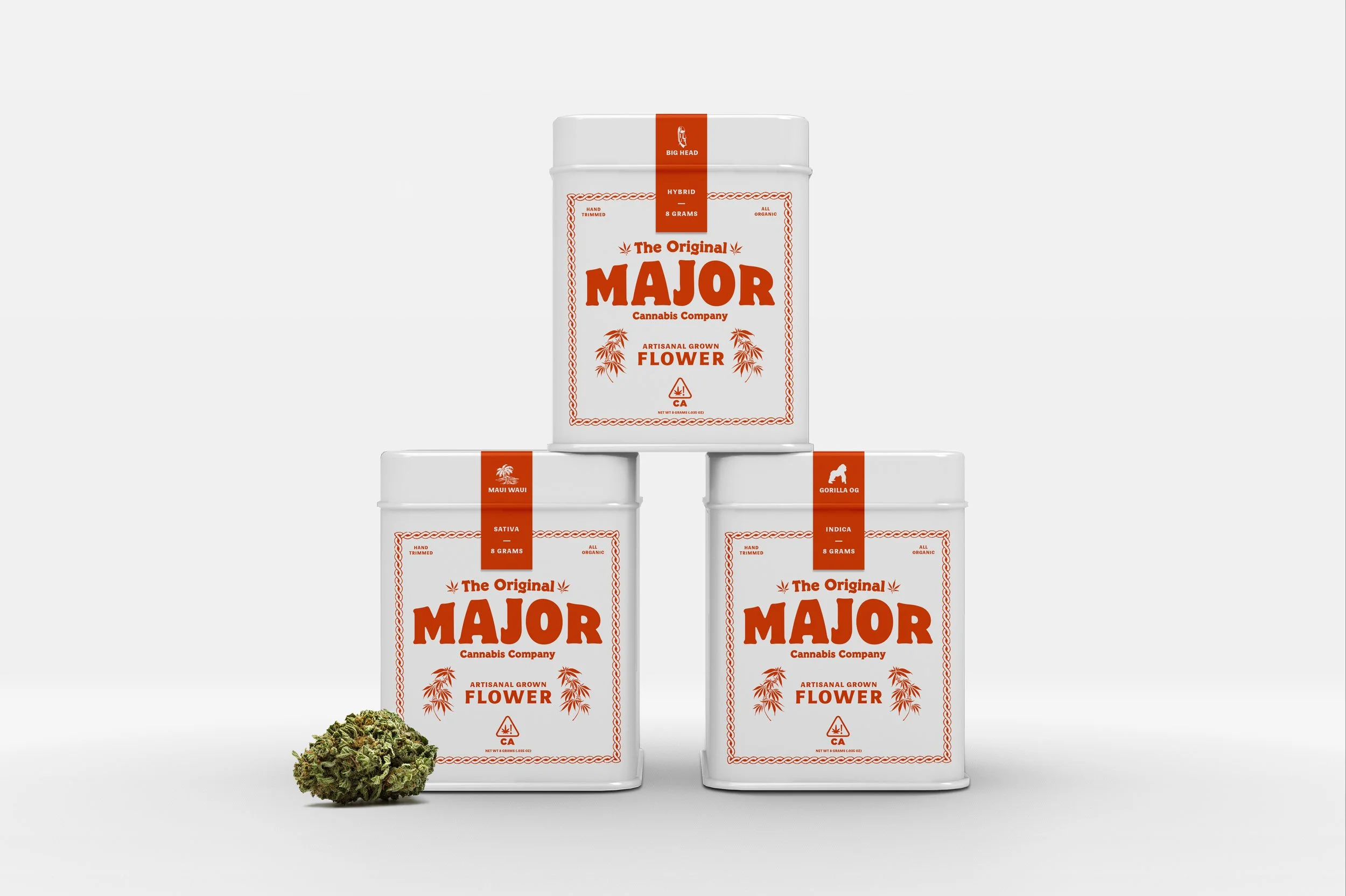


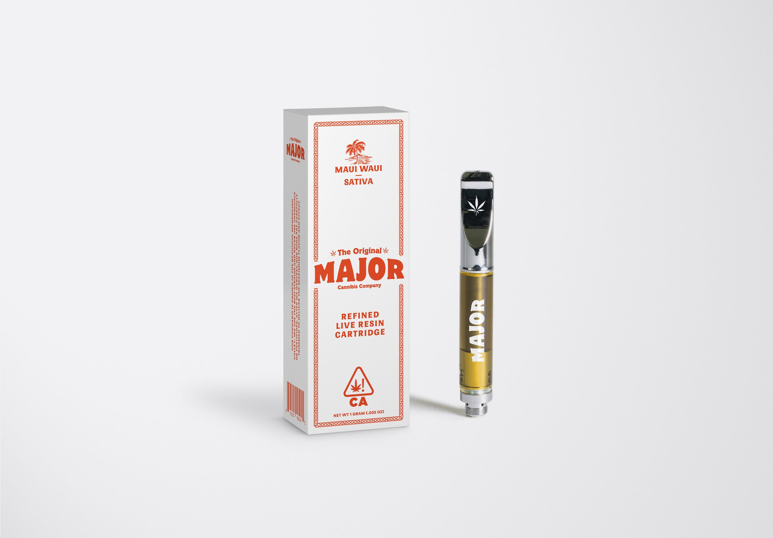


MAJOR CANNABIS CO.
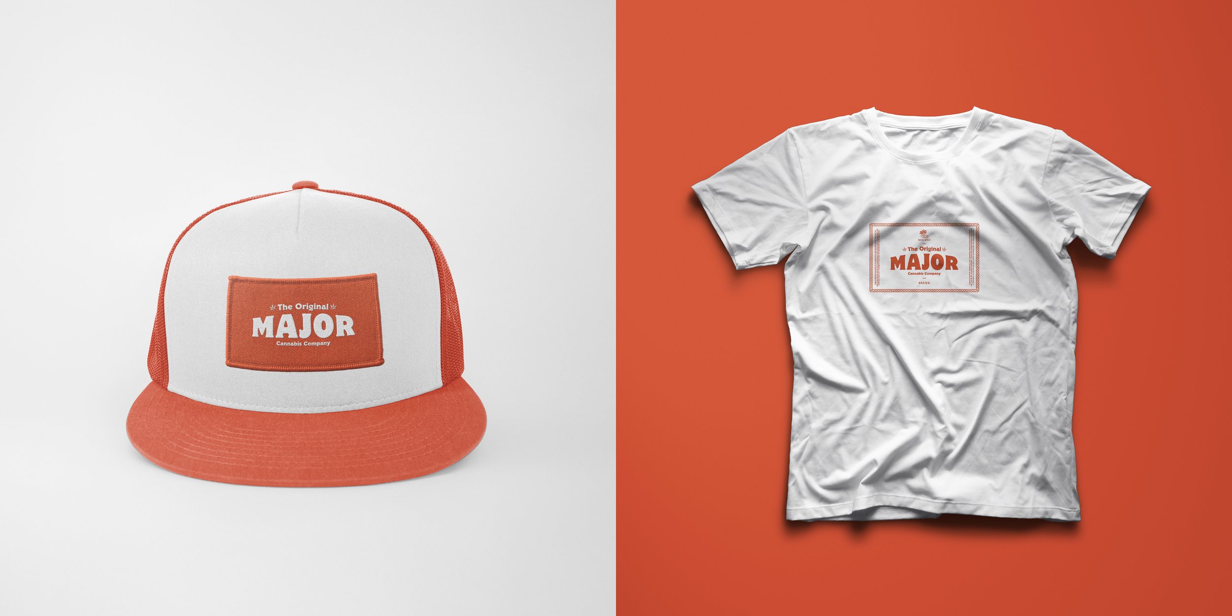
Tarukino Brands needed a brand identity for a new line of cannabis products featuring their specialty strains and proprietary Sorse extraction technology. The name Major is taken from 1970s and 80s surfer slang and speaks to the quality and potency of the products. Chad collaborated with the Tarukino team to design a visual identity and packaging system that builds brand loyalty and helps the product stand out on crowded dispensary shelves. Drawing inspiration from cigar boxes and old island adventure film posters, Chad created a packaging system that blends humor and nostalgia and is unique in the cannabis space.
SCOPE
Concept, Identity, Packaging, Collateral