THE BITTER HOUSEWIFE
THE BITTER HOUSEWIFE
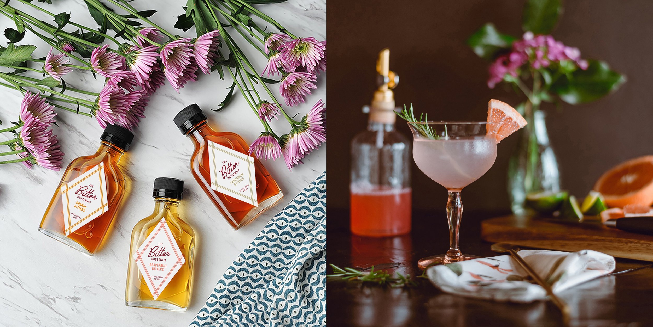
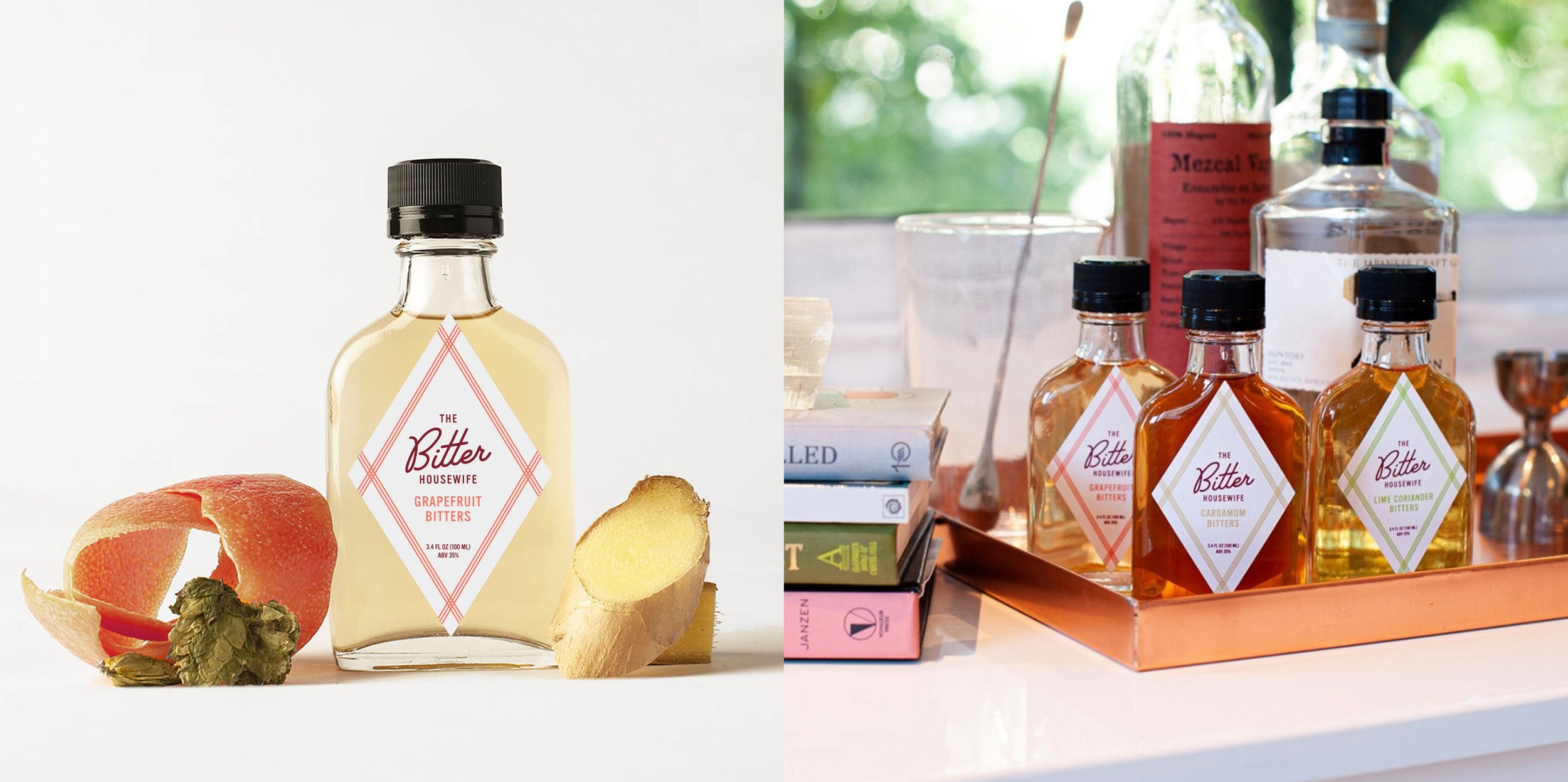
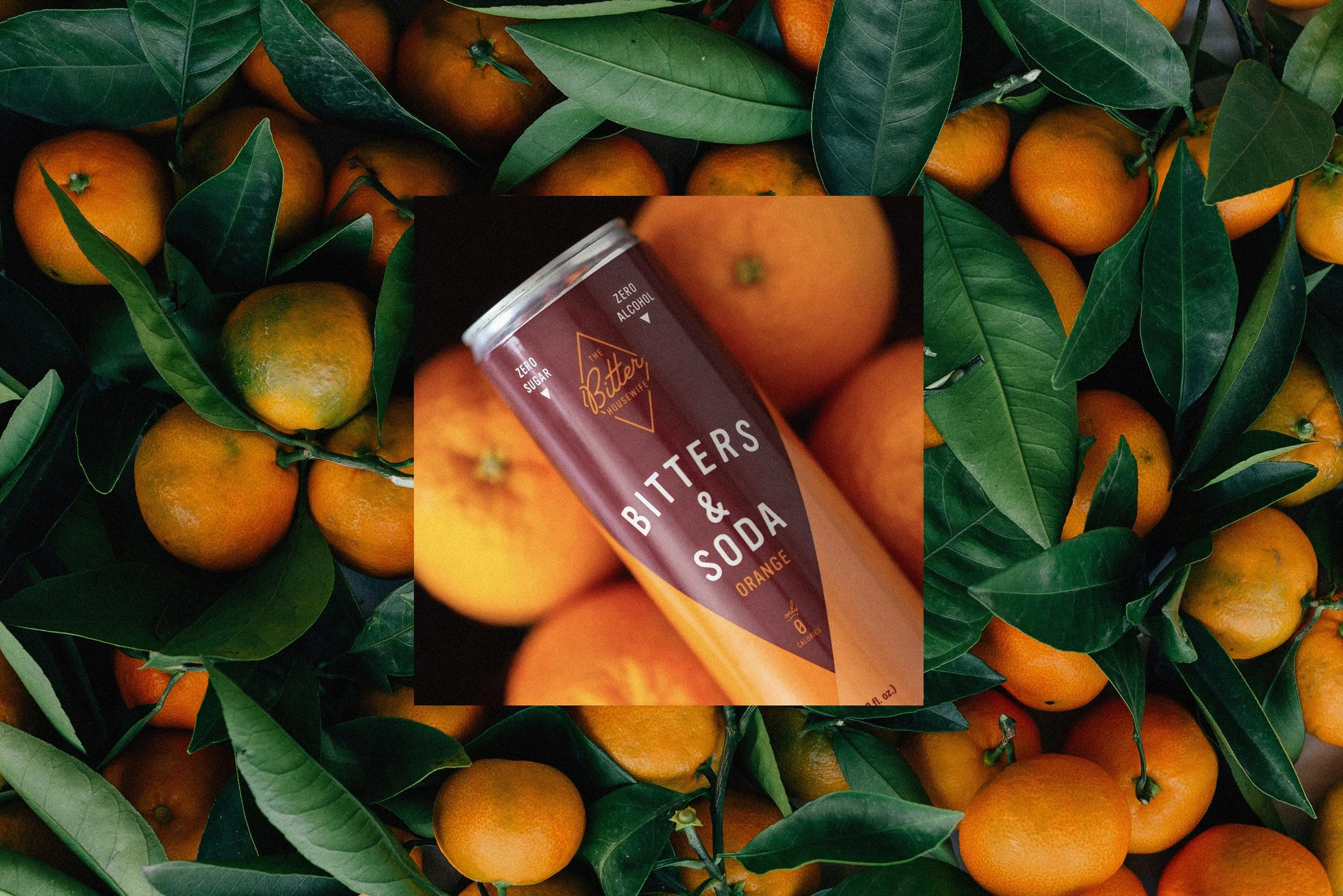
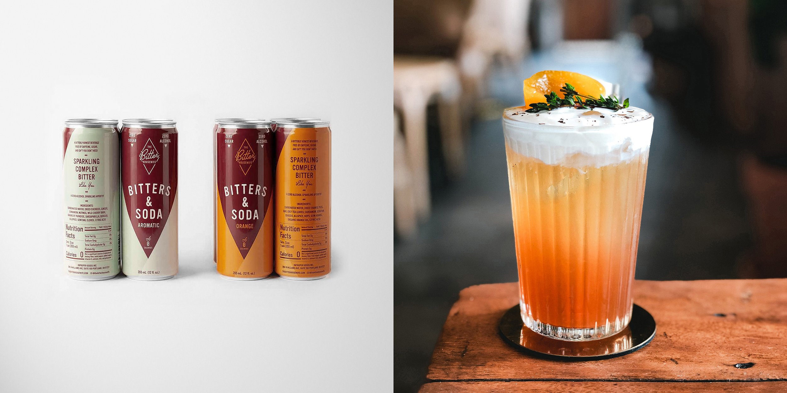
A husband-and-wife start-up needed an identity for their bitters brand that, in their words, “feels like it just belongs behind the bar.” The Portland, Oregon-based maker of small-batch bitters believes that great cocktails are made with real ingredients. This philosophy is infused into their bottled bitters and their ready-to-drink bitters and soda. The brand is bold and snarky with a playful sophistication. Chad spearheaded the design of a visual identity and packaging system that captures the brand’s quirky tone. The wordmark has a mid-century vibe, while the rich burgundy color has a timeless quality that acts as a neutral with the expanded color palette.
SCOPE
Concept, Identity, Packaging, Guidelines


